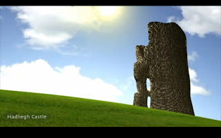
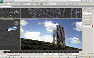
I wanted the scene for Hadleigh to be looking up at the tower, from lower down the hill on which it is set. This would allow the viewer to look up at the sky and the sun, as well as the hill and the tower.
I started by creating the hill for my scene.
I used a sphere as the base, and removed allt he polygons from the rear side, as I would not be using these, and by having left there, it would take longer to render when the scene is finished, so I decided to discard of these early on.
I then shaped the hill around the tower. I placed the tower with the base slightly implanted into the hill, so that it looks built onto the hill, as opposed to placed on the hill.
I did add a hair and fur modifier to the hill at first, however, after a test render, it took far too long too render just one frame, so I decided not to include it.
Instead, I found a realistic grass image, and used this in the material editor, and made it look as realistic as possible, also using the UVW map to get it in the correct position.
For the sky, I added a flat plane at the back of the scene and added a sky image. I then turned the self illumination up to 100% so that no shadows would be cast on it.
For lighting, I used an ultra bright Omni, that sits behind the castle, high in the sky, but still viewable. I added a glow to the Omni, so that it is viewable, and colour it a light yellow colour, with a slightly darker yellow hue to the outer glow ring.
Now my scene was complete, and all that was left to do was animate it.
I used a camera low down on the scene, looking up at the castle and the sky and sun. I made the sky move to one side as the clip progressed, to give the impression that the clouds were moving.
Monday, 25 October 2010
Friday, 15 October 2010
Hadleigh Castle.
I felt that Hadleigh Castle would be a good location to model for our animation.
The ruins of the castle sitting atop a hill would be a great scene once rendered, and you would be able to catch the sun and sky in the scene aswell as the castle itself.
For this scene, I decided to model one of the remaining towers of the castle, as this is the most recognisable part of the remaining ruins.
To create my model, I started with a cylinder, which I made into the rough dimentions of the castle tower.
From here, I chose to discard of the middle sections of the top and bottom caps, as well as part of the side.
As you can see from looking at photos of hadleigh, a large portion of the side is missing.
Once these polygons had been deleted, I had to stitch together the open gaps of the model using the creat polygon tool. This would ensure that my model is completely solid with no holes or gaps in thew actual mesh.
Once this had been completed, i could start modelling the features of the tower.
I started by creating the windows in the tower.
The windows of the tower are small vertical slits, that are bevelled into the castle walls from the inside.
I also created the lumps and bumps on the sinde of the tower, which would have once been the floor to the different levels of the tower. all that remains of these floors are parts along the tower walls. I extruded the polygons where these features are.
Now I moved onto the outside of the tower, where I replicated the uneven top the tower.
The tower roof, and some of the top parts of the tower wall are missing, giving it an uneven surface around the entire tower.
Iused a combination of soft selection modifying and regular modifying to achieve the desired effect.
Once this was complete, I could move onto the rest of the outside of the tower.
The tower isnt perfect verticle, and actuals bevels out towards the base, so I replicated this in my model.
Now the model itself was complete, and it was time to add a material to the tower.
I used a brick material I found in the Program files of 3DSMAX for the texture of my model.
I imported this image into photoshop, where I played with the colour of the bricks, and then saved the image, to use again in 3DSMAX.
In order for the material to wrap around the tower correct, I used a cyclindrical UVW Map.
I then added a bump map of the same image to give the material more realism.
Tuesday, 5 October 2010
Change of Plan
At this stage in the game, we spoke to Jo Bowman about our idea.
However, she stated to us that around 10 other groups all had the same idea as us and were going to use it also.
We felt extremely disheartened by this, as we though we had come up with a unique idea for our project.
We decided to change our idea all together.
No longer would we go for simple renders for our animation. We were now aiming to out do everyone else, and create high quality, realistic renders, to our best ability.
We scrapped the revolving earth idea also, and found inspiration for our new idea from such adverts as Visit New Zealand. In these adverts, a showcase of locations is put infront of you, with a calming soundtrack. We wanted to recreate one of these for Essex.
This was our new idea, and away we went!
Friday, 1 October 2010
Basic Models.
As we would be showing various places around Essex, I decided a good way for the viewer to identify each location would be to include place signs in the scenes.
I started with a Chelmsford Sign.
This would then act as a base for each time we add a new place to the animation, all that would need to be change would be the material which is placed on the model.
To create the sign, I started with a box, that I made extremely flat.
I ensured that the largest face dimentions were of rough size of the real thing.
This would make it easier when applying the material.
I then created a long cyclinder, which would act as a leg for the sign. I then cloned this shape.
These two shapes were then moved into position as the legs for my sign. These were then attached to the main panel, so that if the object is moved, all parts move accordingly.
I then used an image of the actual sign used around Chelmsford as the material for my sign. I cropped and corrected the image orientation in Photoshop, before applying it to my model in the material editor.
For the legs, I applied a Satin Grey finish, which replicates the dull grey finish on most sign post legs.
Subscribe to:
Posts (Atom)